I hope you enjoy my dog's special guest appearance!
Monday, April 4, 2022
Sunday, April 3, 2022
Final (Fantasy) Thoughts
It feels like just yesterday since I started this project. I am proud of myself for all I managed to teach myself in such a short period of time.
Honestly, I took this class with a completely different idea in mind of what was to come. I have said this like a billion times, but I seriously thought this was a literature class.
Even though I felt totally lost for most of the year, I am still really happy I took this class. It truly changed the way I consume media, and I'm not even saying that because it's in the syllabus. I genuinely view everything now through an analytical eye, even advertisements or media I consume for fun.
For example, I was watching a show (Euphoria, if you were wondering) the other day, and I found myself pondering the shot choices and the camera movement. It actually shocked me, because it just came so naturally, when before I definitely would not have even noticed.
I also go as far as to look at color choice in advertisements; the other day I saw a billboard for McDonald's and noticed that they used yellow and orange, as a way to manipulate the viewer into making them feel hungry. I was astonished how much everything is supposed to influence our decisions and how we just go our entire lives without really noticing or caring.
I'm happy to say that because of this class, I have a newfound love for film. Most of my closest friends are really passionate about film, and I'm happy that I can finally share that love with them. Before this project, it was always very difficult for me to sit through films (probably due to ADHD lol), but now, as long as I can analyze the contents with a friend, I actually look forward to it.
I have also actually started a tiny, just-for-fun production company comprised of my best friend and boyfriend, who were the actors in my film. Our summer project plans include making a comedic version of my opening film, as well as a music video for the song Feel Good Inc. by the Gorillaz.
Something that shocked me about this project is how well-versed you have to be at pretty much everything in order to create a good film. You have to be creative, good at writing, good at drawing, good at visualizing, good at socializing, good at leading, good at editing, and good at cinematography. I respect people in the field a lot more now, especially after trying to make a decent storyboard and failing every single time. There is so much that goes into making a film, and I wish those behind the scenes got as much recognition and compensation as the stars.
Overall, I wish that I had known at the beginning that I could be more creative, as I thought we were only allowed to stick within our realm of knowledge. Had I known I had more freedom, I probably would've gone a different route, with less dialogue and more visually appealing shots (for example, a witch walking through a forest). Additionally, I probably would choose slightly different shots (more mid shots and close ups) and made the tone shift less dramatic, but other than that, I am quite pleased with the way things turned out.
Wow, I cannot believe it's over already. Thank you for joining me on this crazy ride, and I hope you stay tuned for my upcoming works!
- Daisy, signing off
Saturday, April 2, 2022
Hard Work Paying Off!
At the beginning of this project and throughout my whole process, I have kept a note in my phone, planning out all of my blog posts.
Friday, April 1, 2022
Production Logo
I edited my production logo in an app called GoDaddy. I used the free logo and shape options when making my logo. My production company is Rose-Colored Productions, an allusion to the name of my blog.
The problem with this one was that it looked really weird. I asked my friends what they thought and they both said it looked very strange, like a bunch of random shapes thrown together (to be honest, they weren't wrong).
I decided to do away with the shapes and instead add a pretty graphic in the center of the star. I realized, though, that it looked weird and very unprofessional.
I decided to stick with the theme of "rose" and use a rose as my main logo. I liked this idea a lot, and color matched the text to the color of the rose.
I was not a big fan of the text, though, as I thought it looked weird and bulky next to the rose. So I tried a slightly softer font, yet it looked a little childish.
I found a thinner, more mature font and decided that this would be the one.
My Final Logo :D
I am happy with how it turned out!
Subscribe to:
Posts (Atom)
Critical Reflection
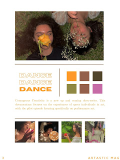
My documentary package, Courageous Creativity, focuses on queer artists. I did a lot of research in and out of class in order to create my p...

-
Okay, I'm going to be honest. I wasn't expecting to not see my teacher and classmates the entire week, and I decided to put off sett...
-
My documentary package, Courageous Creativity, focuses on queer artists. I did a lot of research in and out of class in order to create my p...
-
Besides the fact that I am editing the videos I take on Adobe, I also was doing research and stumbling upon an editing app I used a long tim...


