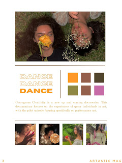
Font choice is very important for documentaries, as it is always necessary to introduce subjects' names and their occupations. Sometimes, it is also important to further ideas that are necessary to the documentary.
Typography is the official word for what is more commonly referred to as "font type." Typography is the collective features that make up the style of printed material. This includes:
- Font style
- Font size
- Letter spacing
- Letter thickness
There are other features that matter too, such as the background color, negative space, density of content, average size of words, etc. Typography sets the tone and the mood for the content, and actually can involve quite a bit of psychology.
As someone who thoroughly enjoyed AP Psychology and plans to pursue the subject as a major, I know first hand that it is involved directly with most things in life, especially when those "things" are media. Consider the internet, for instance. Unique typographies may be found on several websites. Owners of websites consider what their audiences will find appealing. They will take into account if the typeface serves the website's content, whether it be straightforward information, commercial sales, or conspiracies. By these ideas, common norms and beliefs may be seen: Calibri is playing it safe, Times New Roman resembles newspaper writing, cursive is reminds people of antique parchment scrolls, etc. These affect the readers' opinions, assumptions, and feelings initially about what they are seeing. Usually, I have found that you can tell off of "vibes" alone whether a font matches its intended purpose, but there are also many other specific factors that make it easier to pick your fonts in a more sure way.
https://cognitiontoday.com/font-psychology-research-and-application/
https://mindthegraph.com/blog/scientific-fonts/
https://files.eric.ed.gov/fulltext/EJ1105535.pdf


No comments:
Post a Comment