My target audience is going to be younger individuals and artists, so because of this, I would love to incorporate pops of color and intriguing shots into my magazine spread. Also, I think playing around with the formatting to make the text look less intimidating would also benefit my viewers who are younger and most likely have stunted attention spans (no offense, because me too).
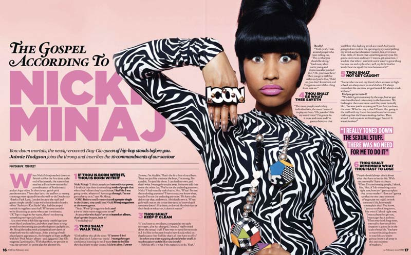


Although these are three magazines that are not really about documentaries or anything traditionally educational, I realized that I really like the style that the creators were going for. One magazine cover features a celebrity, and I wanted to take that inspiration perhaps with one of my subjects instead. I think the idea of the focal point of the page (besides the word content) being one individual makes it easier for the reader to digest and become initially intrigued.
These were all examples that I found to be the most visually appealing, with colors that demand attention without too much distraction. Everything is interesting and cohesive looking. The content features issue and topics from pop culture, and I figure that it would be fun to parody that aspect of magazines in mine by talking about one of my subjects in a satirical, "click-baiting" sort of way.
My favorite part about the last example which I found to be heavily inspiring is probably the fact that the text was altered to become a part of the visual imagery as well. The gaps in the text act as a representation for the veil of the dress, but is subtle enough that the reader would have to pay attention somewhat to catch that detail.


No comments:
Post a Comment